Top Fonts and Color Combinations for Wedding Video Invitations: 2025 Design Trends
When it comes to wedding planning, the first impression is everything—and your wedding video invitation is exactly that.It offers your guests an initial glimpse into your special day, establishing the overall tone and style of the event. From the music and animations to the fonts and colors, every detail matters.
Selecting the perfect font and color scheme for your wedding video invitation goes beyond visual appeal—it helps express the heart of your relationship. Whether you’re going for a royal, modern, rustic, or minimalist vibe, the right combination can make your video invite truly unforgettable.
In this comprehensive, SEO-friendly, plagiarism-free blog, we’ll walk you through the best fonts and colors for wedding video invites in 2025, along with tips to help you choose the perfect match for your theme.
🎨 Why Fonts & Colors Matter in Wedding Invitations
Before diving into the recommendations, let’s understand why fonts and colors are so crucial in video invites:
They set the tone of the wedding—whether it’s classic, contemporary, or cultural.
Convey emotion—elegance, romance, joy, or luxury.
Enhance readability, making sure guests don’t miss key details like the date or venue.
Complement your theme, ensuring your invite matches the overall wedding aesthetic.
When done right, fonts and colors can take your wedding video invitation from ordinary to absolutely enchanting.
✒️ Top Fonts for Wedding Video Invitations
Here are the most popular, timeless, and elegant fonts perfect for digital wedding invites:
1️⃣ Playfair Displayt
Style: Classic and romantic
Best for: Names and headers
Why it’s effective: The gentle pink paired with creamy hues adds a touch of elegance and romantic warmth.
2️⃣ Montserrat
Style: Clean, modern sans-serif
Best for: Body text or RSVP details
Why it works: It pairs beautifully with decorative fonts and ensures readability on all screen sizes.
3️⃣ Great Vibes
Style: Flowing calligraphy
Best for: Highlighting names or quotes
Why it works: Its romantic, handwritten touch adds personality and charm.
4️⃣ Cinzel
Style: Regal and bold serif
Best for: Royal-themed or grand wedding invites
Why it works: Inspired by classical Roman typefaces, it adds instant grandeur.
5️⃣ Dancing Script
Style: Playful, friendly, semi-cursive
Best for: Informal weddings or save-the-date cards
Why it works: It gives a warm, personal vibe while still looking polished.
6️⃣ Cormorant Garamond
Style: Elegant, traditional serif
Best for: Sophisticated and minimalist designs
Why it works: Its thin, graceful letters give your invite a refined appearance.
Font Pairing Tip: Always pair a decorative or script font (for names) with a clean sans-serif or serif font (for details). This balances elegance with readability.
🎨 Best Colors for Wedding Video Invitations in 2025
The colors you choose set the overall tone and emotional vibe of your wedding celebration. From luxurious golds to calm pastels, the colors you choose tell your guests what to expect.
1️⃣ Dusty Rose and Champagne
Vibe: Romantic and timeless
Best for: Classic or vintage weddings
Reason it stands out: The delicate pink combined with creamy shades adds a refined and romantic touch.
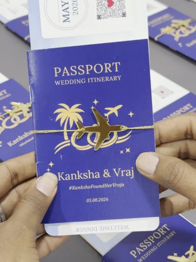
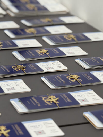
2️⃣ Navy Blue and Gold
Vibe: Royal and elegant
Best for: Formal or regal-themed weddings
Why it works: Navy is powerful and sophisticated; gold adds the touch of celebration.
3️⃣ Emerald Green and Ivory
Vibe: Earthy and luxurious
Best for: Nature-inspired or outdoor weddings
Why it works: Emerald adds richness, while ivory softens the look.
4️⃣ Sage Green and Blush
Vibe: Fresh and romantic
Best for: Boho, garden, or rustic weddings
Why it works: This pairing is gentle on the eyes and universally flattering.
5️⃣ Terracotta and Cream
Vibe: Warm and modern
Best for: Minimalist or fall weddings
Why it works: These muted earthy tones feel grounded yet stylish.
6️⃣ Black and White with Metallic Accents
Vibe: Bold and sophisticated
Best for: Glamorous evening or city weddings
Design Tip: Stick to no more than two or three colors to maintain a clean and cohesive look.
Design advice: Limit your palette to just two or three shades to keep the visual style clean and harmonious. Too many colors can look messy and dilute the overall effect.
💡 Tips for Choosing Fonts and Colors
Choosing fonts and colors isn’t just about what’s trending—it’s about what resonates with you. Follow these helpful suggestions to ensure your design is both stylish and meaningful:
1. Match Your Wedding Theme
If your wedding is vintage-themed, go with classic serif fonts and muted colors. For a modern celebration, opt for clean lines and bold contrasts.
2. Prioritize Legibility
No matter how beautiful your font is, if it’s hard to read, it defeats the purpose. Use decorative fonts for names only, and stick to clean fonts for essential details.
3. Use Contrast Strategically
Make sure the text stands out clearly by using contrasting shades for the background and font. Light fonts on light backgrounds or dark on dark rarely work well in videos.
4. Test on Mobile Devices
Since most guests will view your invite on their phones, make sure everything looks good on smaller screens.
5. Stick to Your Wedding Color Palette
Keep your video invite aligned with your wedding decor, outfits, and flowers for a seamless visual experience.
🧡 Final Thoughts: Make It Personal & Meaningful
Your wedding invitation video isn’t just about fonts and colors—it’s a digital love letter to your friends and family. While trends come and go, what remains timeless is the feeling your invite evokes.
By thoughtfully selecting fonts that reflect your style and colors that speak to your wedding theme, you’ll create a wedding invite that’s not only visually stunning but also emotionally impactful.
Whether you’re going for minimal elegance or royal extravagance, let your design choices tell your story—boldly, beautifully, and authentically.


